


A strategic redesign for a multi-service brand, balancing
two distinct products under one cohesive system.
Designing connection
in the digital age
Client
Nexomatica
Service
Branding & UX/UI
Industry
Finance
Nexomatica and Nexobroker are two tech startups in the finance sector aiming to become leaders in the digital transformation of financial services. Through advanced technological solutions, they help SMEs access credit quickly and under favorable conditions, while also supporting banks in the evaluation and lending process.
Big challenge
for a big project
The goal was to develop a visual identity that reflects the technological core of the two startups, which belong to the same group but address different audiences in B2B and D2C contexts.
One of the main challenges was clearly differentiating two distinct services within the same brand: Nexo Matica and Nexo Broker, each with different audiences, goals, and use cases.
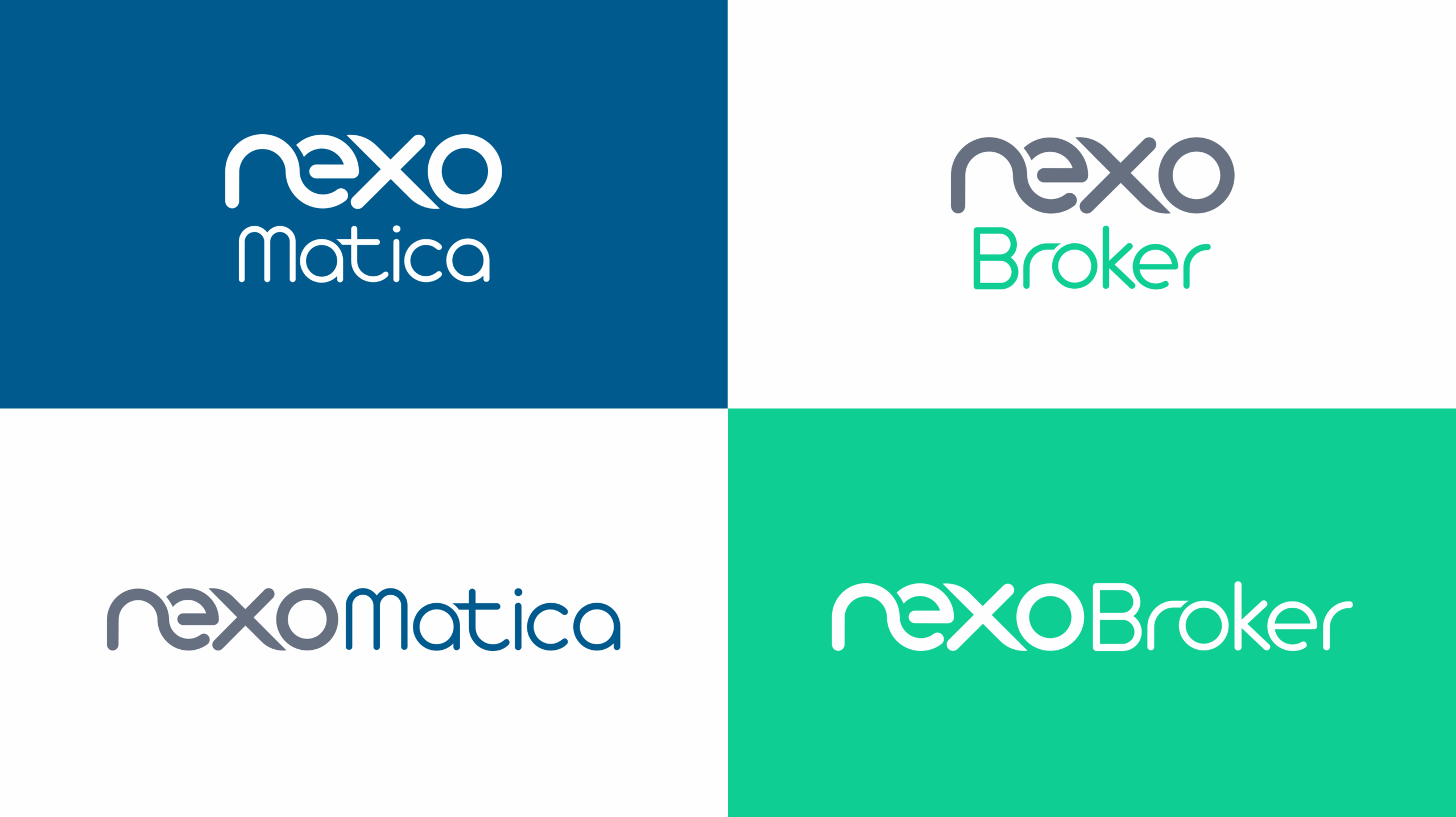
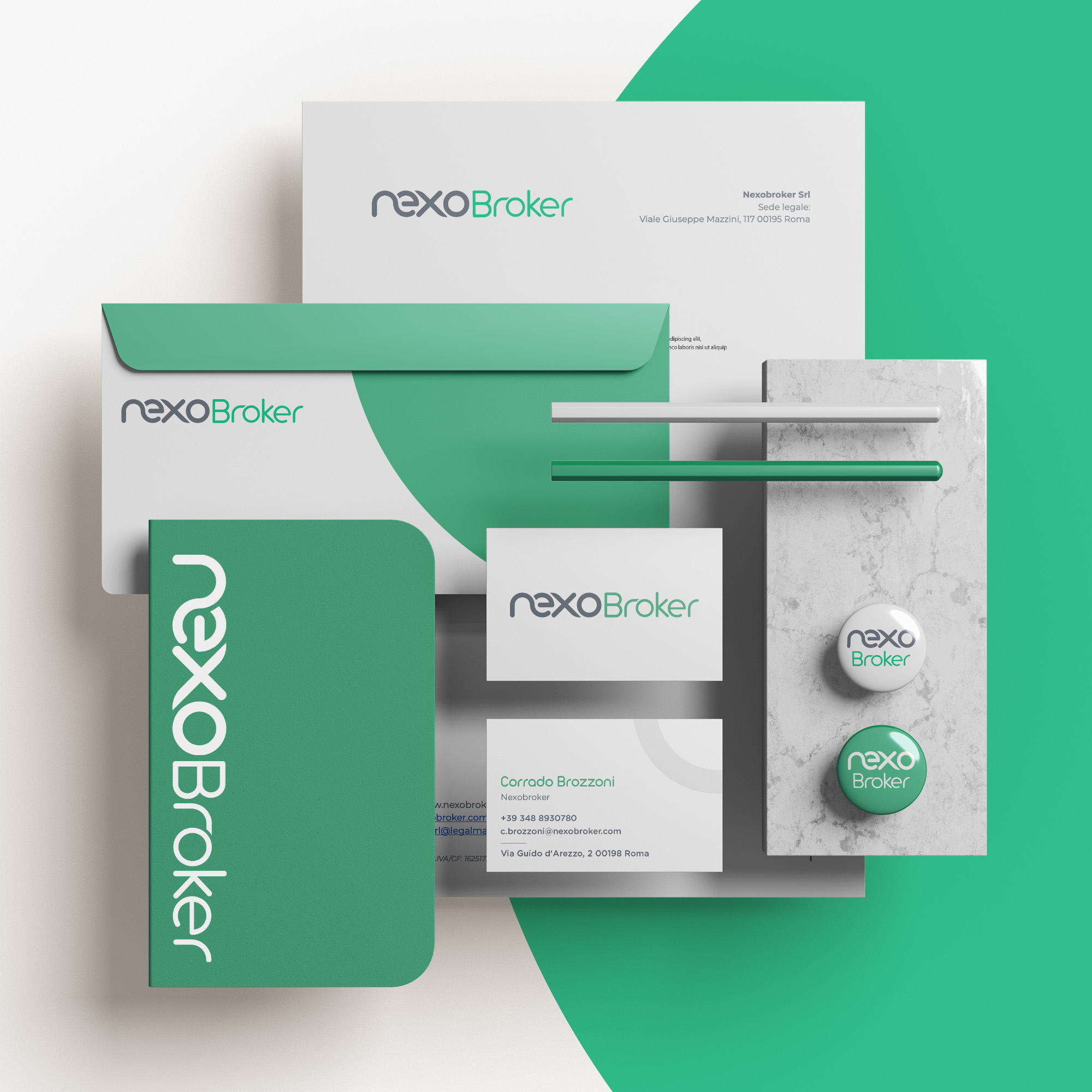
I therefore created two elegant and minimal Visual Identities: a visual language with a corporate feel, enhanced by color palettes, lines, and geometric elements that convey the modernity and innovation of digital solutions.
The project began with the creation of a fresh and contemporary Visual Identity, designed to convey consistency across two distinct logos. A thorough brand study was conducted, including a detailed questionnaire with questions that helped create a logo reflecting both the company’s and the client’s vision.
Two services,
one brand system
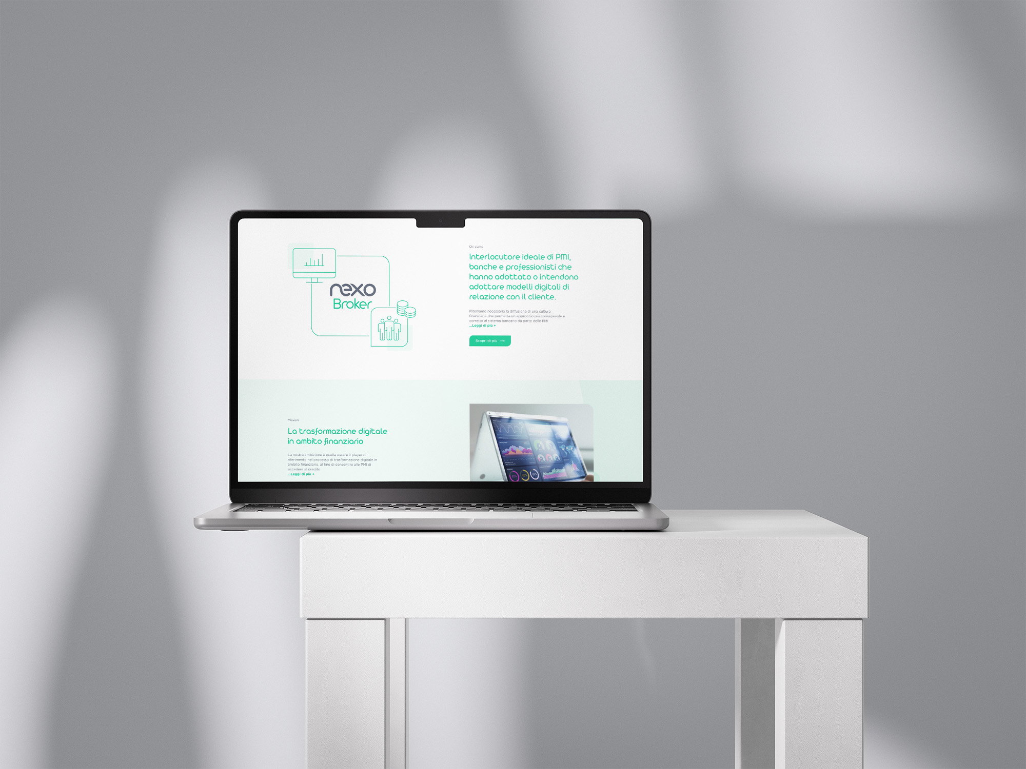
To support clarity and positioning, the brand was structured around two color-driven identities: Blue for Nexo Matica, focused on security, trust, and digital identity. Green for Nexo Broker, representing growth, finance, and investment.
After defining the logo, the work continued with the creation of the brand guidelines, compiled into a brand manual. Clearly and concisely, the manual outlines the journey from concept to visual system, including color palettes, typography, applications, and mockups.
From brand
to product
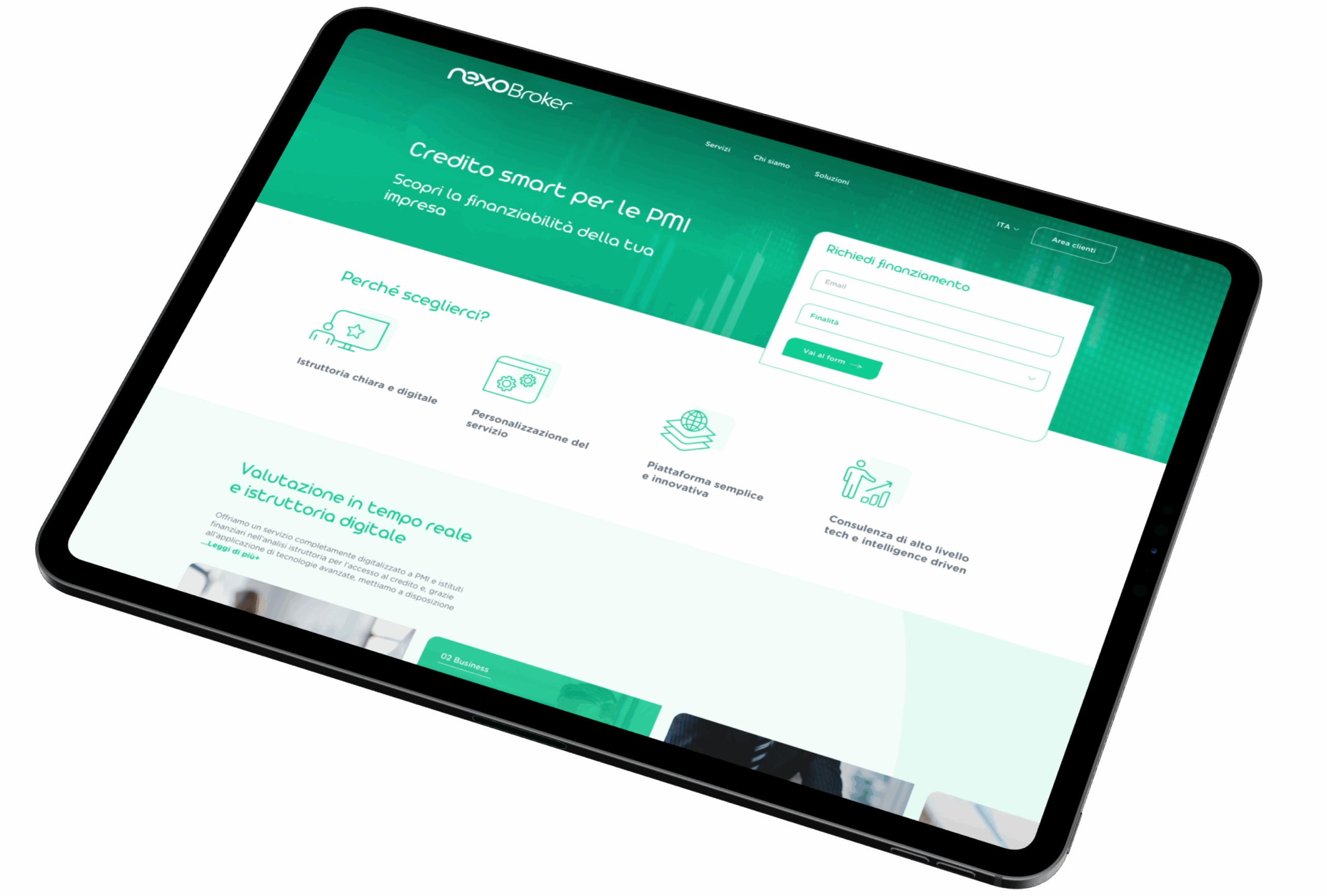
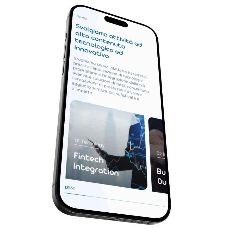
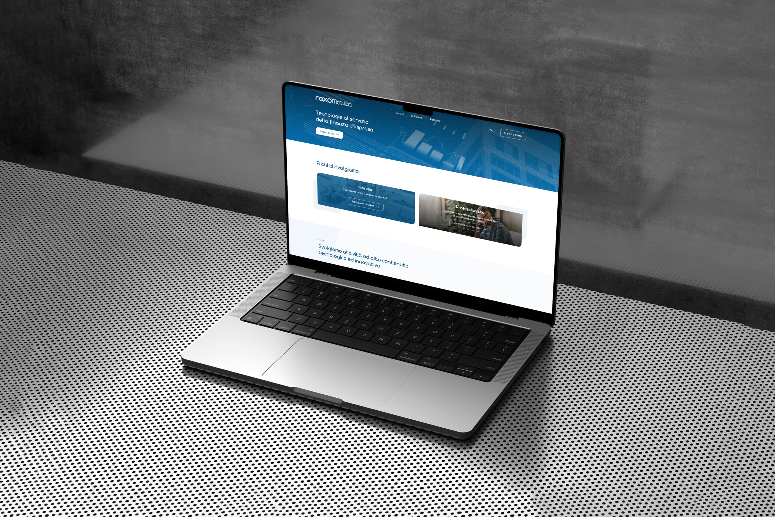
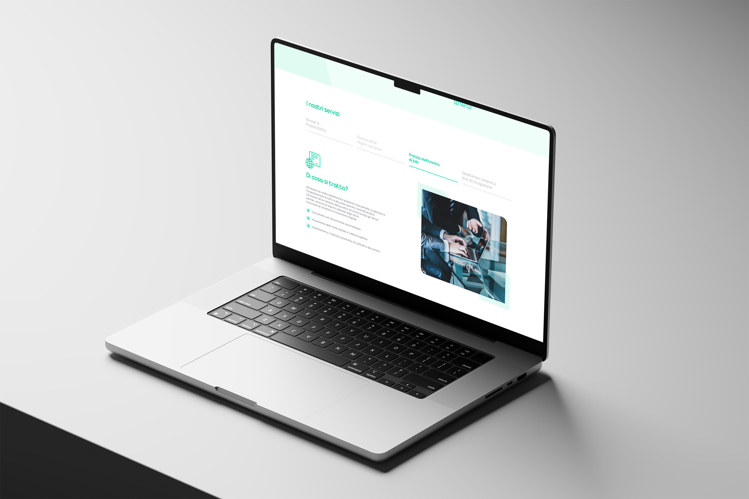
Once the brand identity was completed, I focused on UX/UI design. The foundations defined in the brand manual found their fullest expression in the website design, where the visual identity was translated into a coherent and recognizable digital experience.
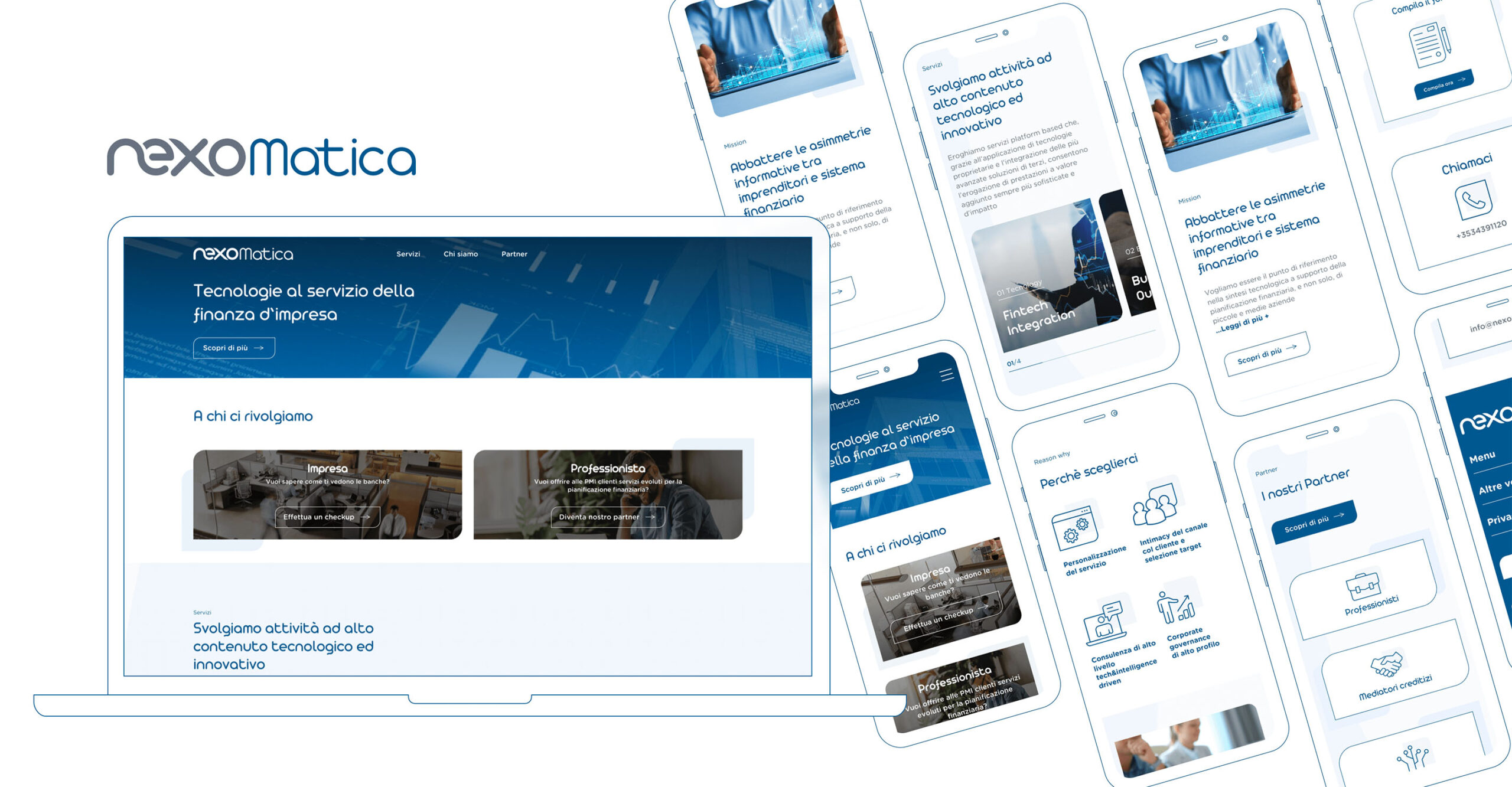
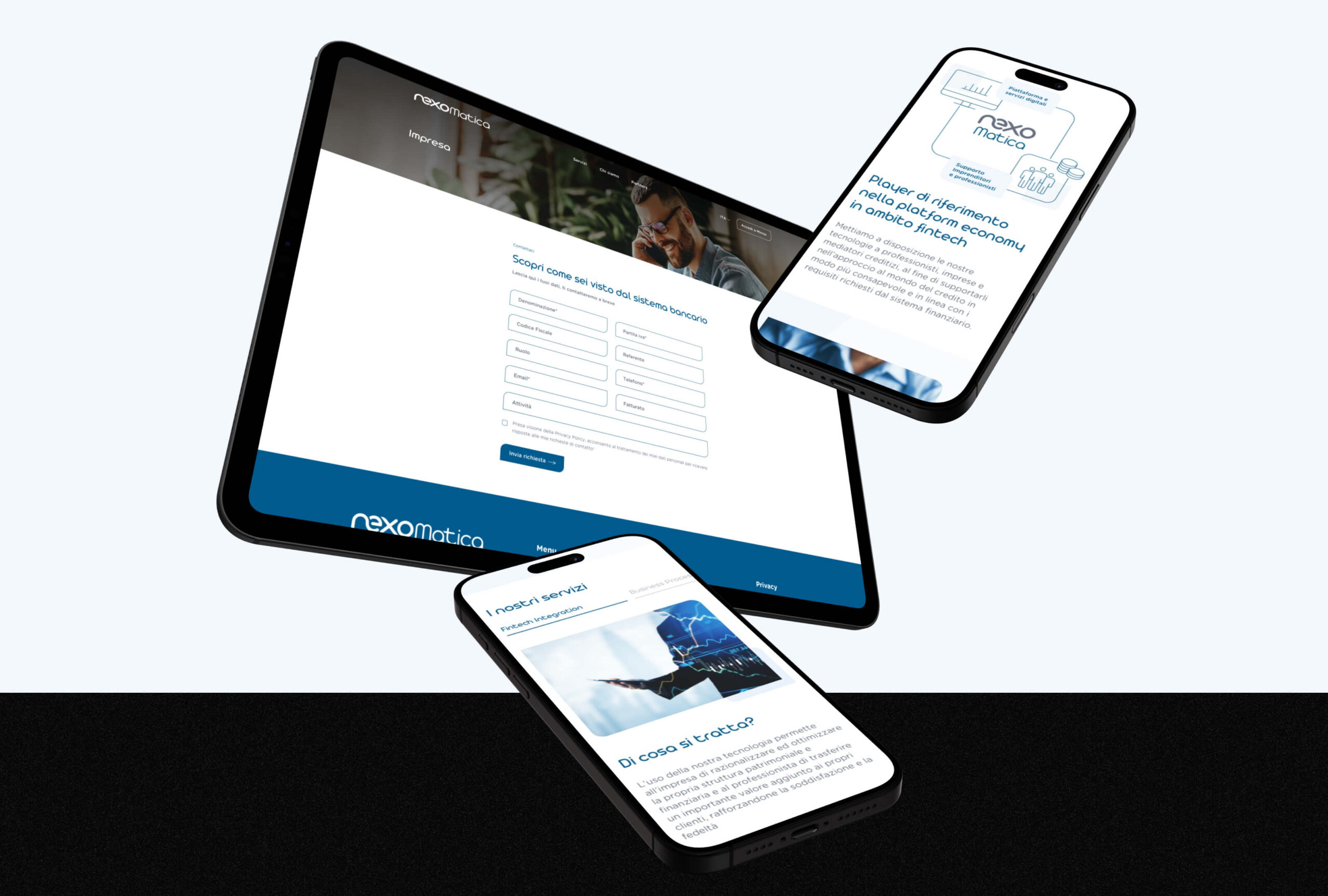
The process began with the analysis and definition of the website’s sections, building the information architecture and hierarchy. This phase was developed in close collaboration with the project manager and the client, who had specific needs and requirements.
The main challenges involved organizing and simplifying the content into a modular and intuitive structure, as well as translating complex concepts into icons and micro-infographics. These elements helped make the website light, clear, and easy to navigate.
The website architecture was designed to guide users toward the right service, reducing ambiguity and improving navigation across the two product areas.
Agency: Secret Key


Let’s talk


Contact:
matteobarchiesi.design@gmail.com

Privacy Policy
